The New Brand: X for Accuracy or X for Anonymity?
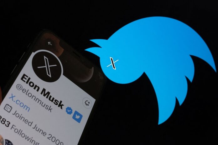
Elon Musk drew an X on the blue bird that has symbolized Twitter since the creation of the social network in 2006.
An X that erases it and replaces it.
Appearing on Twitter on Monday morning, the new logo features the shape of a black X with one of the bars hollowed out – an inspiration from Art Deco-style typefaces, the businessman said.
But what X is it?
That of the signature of an illiterate or an anonymous author? That of the multiplication symbol or the algebraic unknown?
Elon Musk and the company’s new chief executive, Linda Yaccarino, said last weekend that the platform, under its new identity, would branch out into payments, banking and commerce of all types. On October 4, 2022, the polyentrepreneur had already tweeted that the purchase of Twitter, at a price of 44 billion, was “an accelerator for the creation of X, the universal application” (the everything app).
“He had already talked about a great application, so it’s nothing new,” comments Luc Dupont, professor of communication at the University of Ottawa. “But changing the name of a company, or at the very least of an app as he does, is always a perilous exercise. Because in people’s minds, Twitter is about tweets. And what we are told is that soon, it will no longer be quite that. Musk is going to use the goodwill of the 300 million people who are on the platform to launch something completely different. »
Do current users want these other things? These precious tweeters had precisely made their nest with the chirps.
Another pitfall looms.
“If you and I had spoken a year ago, we would probably have thought that Twitter has no competition. But there are three now. »
The decentralized social network Mastodon, Bluesky, of the founder of Twitter Jack Dorsey, and Threads, of Mark Zuckerberg, are now competing with him for his clientele.
However, since Twitter radically changed its vocation, the name change found a justification.
“There was a need for change anyway,” said Benoit Skinazi, co-founder and chief marketing officer of Sharethrough, a company that helps websites and mobile apps monetize their ad space.
“It’s a particularly complicated corporate situation, with a brand image that is quite tarnished. The past few months have seen a lot of upheaval, including layoffs. »
In this context, a drastic change of image allows “to mark a real break between before and after Twitter”, he observes.
Simplicity is not an obstacle to notoriety, he recalls.
“Often the logos that work the best are the simplest logos. We have seen it with brands like Nike. But the symbol of anonymity presents an unusual challenge. “Today, in our world, getting a company called X is pretty much mission impossible, actually. »
“What he is saying is that he is symbolically taking possession of the letter X, in the same way that Barbie has taken possession of the color pink for two months, argues Luc Dupont. It’s the same strategy basically, it’s branding 101.”
The letter X has long been part of Elon Musk’s universe.
“He started x.com bank in 1999, which eventually became PayPal,” he says. He created SpaceX, Tesla’s Model X. He launched xAI last week. »
The letter X has long been phonetically associated with accuracy: Timex, Lexus, Xerox.
“In the minds of the people, in the minds of the common man, I am convinced now that that letter belongs to him.
“Now what remains is the most difficult step: delivering. »
The new logo “made the news [yesterday] morning on all the design blogs,” says Isabelle Allard, creative director, design, at Sid Lee.
The company shake-ups heralded branding and image changes, “but we didn’t expect a total rebranding of its name and logo,” she says.
“Twitter is one of the most famous logos in the world. To erase it completely is surprising. At the same time, it’s very Elon Musk, we can’t be surprised. »
“But I think visually it’s the most shocking,” she adds. The result, the X, is extremely astonishing. »
X is a name and a symbol reduced to their most innocuous expression, close to insignificance.
“There’s just a big brand like this that can afford to own such a simple symbol. »
The expert looks at the logo with a critical eye.
“He’s not very well balanced,” she notes. At first glance, it is so simple that it looks like a first sketch. »
Rumor has it that this is only a preliminary version, still subject to improvement. “It’s weird, I’ve never seen this, a prebranding, ever! When you rebrand, you open the door to criticism. Each time, we try to be as prepared as possible for the launch of the brand. There, it really seems to have been done at short notice, as if we could no longer support this bird.
“However, we feel that it opens the door to something completely new. It’s an X on the past, we can feel it. »


